Windows Phone 7 –Ladies and Gentlemen We Have Lift-off
Dec15Written by:
2010/12/15 08:29 AM 
In my previous review of Windows Phone 7 I stated that I was very impressed with the software. In this review, nothing has changed. It is really a continuation from that post.
Reviewing this phone, a prototype Samsung Taylor, and Windows Phone 7 OS prompted one question. Did Microsoft write this OS. The reason why I ask that is that is so radically different from any previous Microsoft Mobile OS, and what's out there in the market today. My conclusion, is that Microsoft have finally got a good thing going here with Windows Phone 7.
Start your engines
From the moment you turn your Windows Phone 7 on, it looks good. It feels right. From the lock screen to the “Home Page” everything seems to just work flawlessly and smoothly.
Granted it’s not perfect. It is missing a few fundamentals, but hey, being a programmer myself, I know what it’s like bringing a large application to finality. Sometimes hard decisions need to be taken to get the software out. It’s not an excuse, but just an empathetic observation.
Anyway, back to the start. The lock screen is really intuitive and colourful. By choosing your favourite picture as the backdrop, you will always be greeted with something that will make you smile.
The lock screen also serves as a kind of quick summary as to what's going on with your Windows Phone. From displaying the date and time, to also displaying various items that you might have missed. Kind of like mini notifications. How many missed calls, how many messages you’ve missed. Even appointments, events and alerts that have come up.
I found myself regularly just looking at the lock screen to get a quick overview of things that needed attention.
The Dashboard
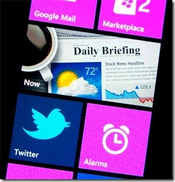
 The live 2-D interface is both radical and refreshing. These tiles are live, meaning if the content of the app or site is updated, the tile will update on your screen. So if you have a link to a friend's Facebook profile on your Quick Launch screen, that tile will update when they change their picture.
If you have email waiting in your Outlook, Google, or Yahoo! mailbox, these tiles will update as well.
The tiles are flat 2-D blocks arranged two abreast. Except for some specific tiles like pictures and calendar which take up one whole row by them selves.
By default, the first four tiles are the same on all Windows Phones: Phone, People, Messaging and Email.
One disappointing thing with the tiles is that they do not auto arrange. So if you are not careful enough you could end up with one tile on a row, a blank space then the rest of the tiles would follow.
What I would have liked to see is that these tile to automatically re-arrange themselves to make better use of the space available.
Most of the tiles lead to what Microsoft have termed as 'hubs'. Places where a whole lot of other functionality takes place. Like the Office hub or the Xbox hub. Going to these hubs gives you more options and functionality. Like going to the Office hub where you will find, Excel, Word, One note, PowerPoint and the ability to connect to SharePoint.
 By taping the tiles you are transported to your favourite app or hub. With a tap and drag you can move the tiles around to arrange them in your preferred way. By tapping and holding them down you get the opportunity to remove a tile from the Dashboard.
If you want to move one of your apps to your Quick Launch display, you simply press down on the app and select "add to quick launch.
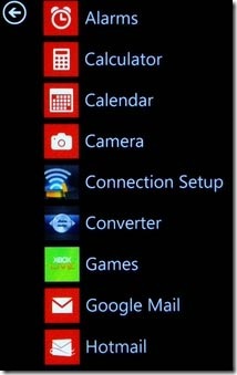
Swiping right takes you to a list of all of your apps. When you're in an app, you'll see a row of other menu options at the top of the display. Like the Zune, you can "pan" through these menu items with a flick of your finger. If you want to go back to the previous menu, you simply hit the arrow key at the top of the interface.
The Keyboard
You must admit that trying to cram a functioning keyboard onto what primarily is a phone is a pretty daunting task. iOS and Andriod did a decent job. The Windows Phone 7 keyboard is as effective and maybe better.
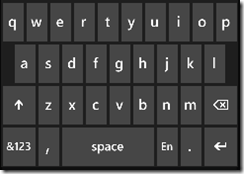
What I like about it is that it is clean and simple. No 3-D pretty rounded keys. Who cares about that? Save that precious screen real estate. Make the keyboard simple yet effective.
 On such a small space you want to use it as best you can. The purpose of a keyboard is to work and cause you to type as efficiently as correctly as you can. It’s job is not to look good.
While the Windows Phone 7 virtual keyboard might not win any graphic design awards it is up there when it comes to ease of use and the amount of correct typing I do.
The better I type the less time I spend on correcting. That's a good thing.
Microsoft has also made word correction fairly straightforward here, either auto-correcting as you type, or allowing you to double tap on a selection and get a few options for alterations.
The other thing I liked was the intelligent selection of keys depending on what you typed. So if I was typing an email address in a designated email box, then forbidden keys like ‘%’ were not available.
Third party apps
Lets face it in today's competitive mobile world, a smart phones life, it’s very existence, is determined by the apps that it has available for it.
If third party vendors and developers decide to start developing Windows Phone 7 apps, then it is going to be a serious contender in the mobile OS market.
At the moment the Windows Phone 7 app store is relatively small compared to other smart phones. But I do believe that it will expand. It has to.
The two things that will hamper application development for the Windows Phone 7 is lack of multi-tasking, and limitations set by the OS.
I know that there is a big update coming soon. It is going to address the multi-tasking issues, but will Microsoft lift some of the OS limitations they have?
I went to the market place and found it very easy and simple to browse. I download a few apps that caught my eye.
One of them being a Bible app. I did this, because I wanted a Bible on my phone, and also because I wanted to test the readability of the phone.
Well I’m pleased to say that it performed admirably. The text was easy to read. I could set the font and size to what suited me.
The scrolling seemed flawless, smooth and responsive. I could scroll slowly and fast. Stopping was easy, I could stop where ever I wanted to by just holding my finger down in one place.
Conclusion
The interface and functionality is really smooth and simple. No fancy un-needed gimmickry. The responsiveness is great, scrolling is smooth.
I must say I like what I see so far. Look, it’s not perfect. But for me, it’s a whole lot better than what was before. It is a serious contender. With the promised updates on their way, I believe that it will get better and slicker and more of a threat to the other OS’s out there.
Watch out for the next instalment of the Windows Phone 7 review.
What are your thoughts?
Remember you can win a weeks worth of free ad space just for commenting. The best comments during the week will get a weeks free advertising space. Check out: Win free advertising for your blog
 New here, or perhaps you've been here a few times? Like this post? Why not subscribe to this blog and get the most up to date posts as soon as they are published.
Get involved in our community. Help promote other bloggers. List your blog in our directory for bloggers. Blog Directory for Bloggers
blog comments powered by